Just like woodworking, publishing is a fractal. You can get lost in the tiniest of details inside of details. And when I say “lost,” I mean the good kind of lost. Like this.
Most of my career has been on the newspaper and magazine side of publishing, where the level of detail work isn’t (and cannot be) in the same league as a designer such as Wesley Tanner, who designed “To Make as Perfectly as Possible: Roubo on Marquetry.” But I’m coming around.
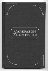
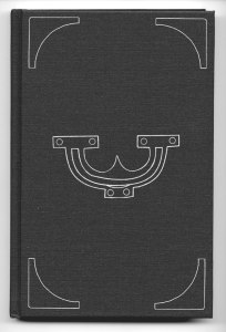
Today I flushed out some rough ideas for the cover of “Campaign Furniture.” These are rough. And did I mention they were not smooth? Rough. The idea is to make the cover look like the top of a traveling chest or trunk. Corner guards are placed at the corners and there is something in the center – either an Anglo-Indian pull or a plate with curved corners and the title of the book.
Yes, I might add screws to the pull or plate. Or I might not muck it up with too much detail. Everything is hand-drawn, which will work nicely with the dies that do the debossing on the cover.
I’ve also been sorting through all the color choices that are possible with this cover. Right now I’m leaning toward a cotton cover that will be a color called “mudpie” – it’s a brownish-red and looks like a lot of the 19th-century British woodworking books on my shelf. The stamp will likely be something coppery or gold-ish. Maybe. Or black.
Or I’ll put a giant smiling narwhal on the cover that’s pooping rainbows.
It could go either way.
— Christopher Schwarz