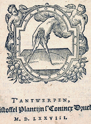
Readers of this page have often seen the logo for Lost Art Press, a pair of dividers. This was developed from an image in one of the plates Joseph Moxon published in the joinery volume in his “Mechanick Exercises.” Chris isn’t the first publisher to use such a mark, he was proceeded in the mid 16th-century by his namesake Christoffel Plantin. Plantin founded one of the most successful printing/publishing companies ever; the company in fact outlived him by almost 300 years. After 1557 Plantin always used a pair of dividers for his mark, and included with it his personal motto “Labore et Constantia” (Labor and Constancy).
One of the design features used in the deluxe edition of “To Make as Perfectly as Possible” is the adoption of Plantin’s mark for the title page. Redrawn from a 1578 version, the motto was changed to “hoc opus hic labor est.” For this we reached even farther back in time to Virgil’s famous poem the Aeneid.

Facilis descensus Averni:
noctes atque dies patet atri ianua Ditis;
sed revocare gradium superasque evadere ad auras.
hoc opus, hic labor est.
The gates of hell are open night and day;
Smooth the descent, and easy is the way:
But to return, and view the cheerful skies,
In this the task and mighty labor lies.
Lines 126-129, translated by John Dryden
True enough, as we found out. . . . Tomorrow, the typefaces used in the deluxe edition.
— Wesley Tanner, designer of “To Make as Perfectly as Possible”